Mazanów Fish Farm
– an identity that came alive
A family farm run by two ichthyologists got a mark its owners take to heart – and wear themselves. From the symbol, through a bespoke logotype, to a full system.

Two scientists and a generational
carp-farming tradition
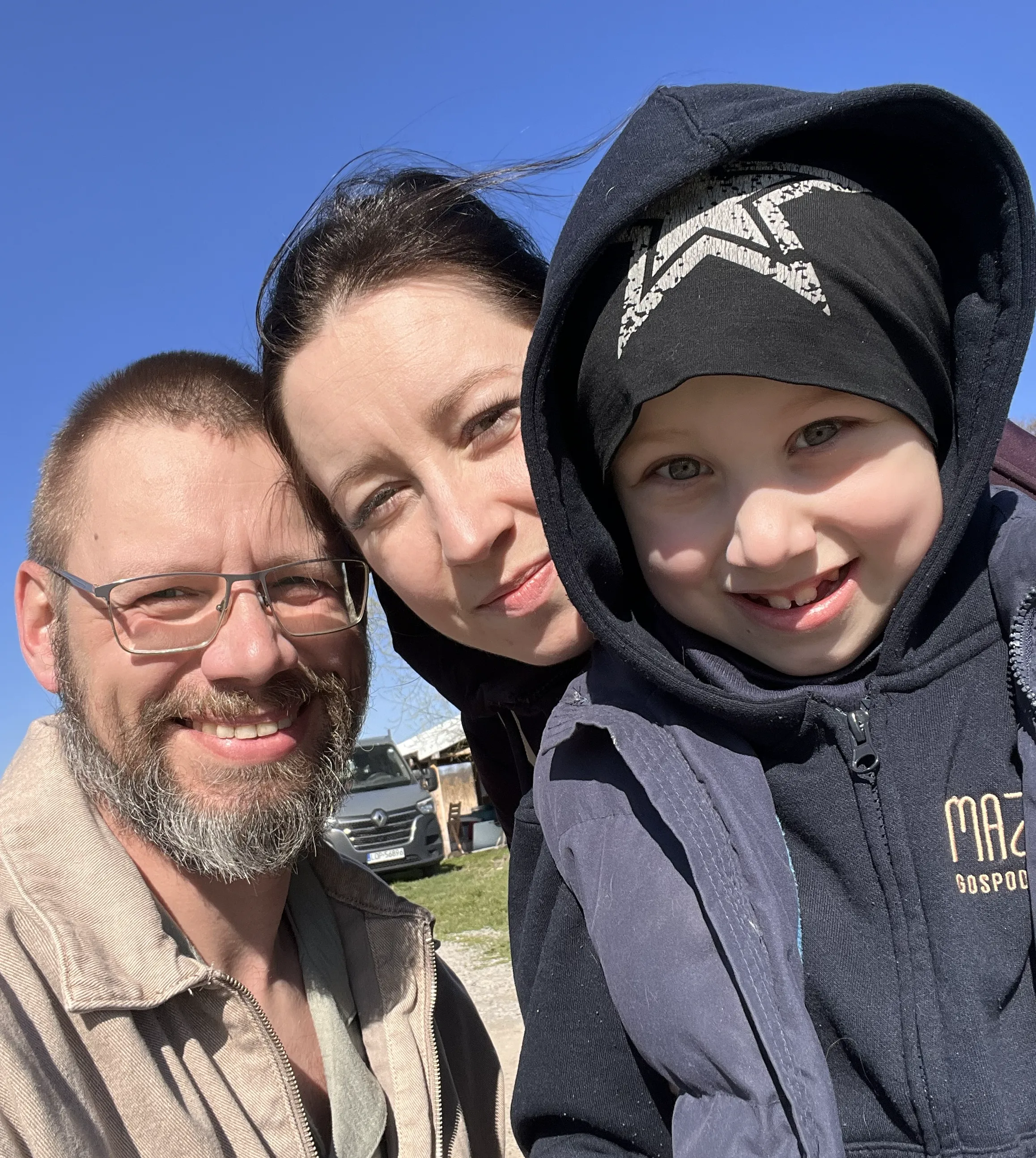
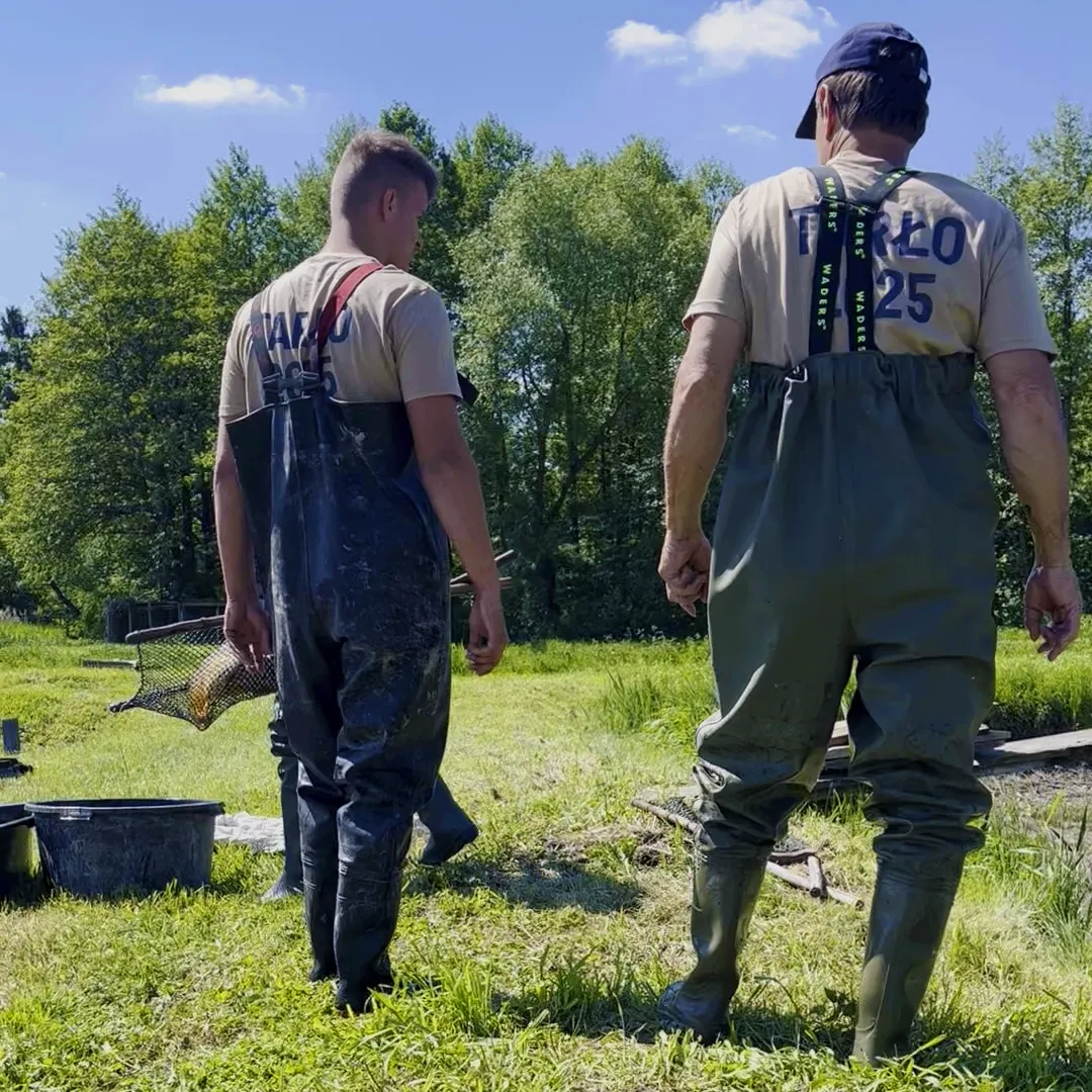
Mazanów is the family business of Justyna and Michał Nowak, run together with their son. Both are ichthyologists – Michał holds a doctorate, Justyna comes from a generational family of carp farmers. Michał uses safe electrofishing for research: catch, examine, release the fish alive.
Science and tradition are not an add-on to this company – they are its core.
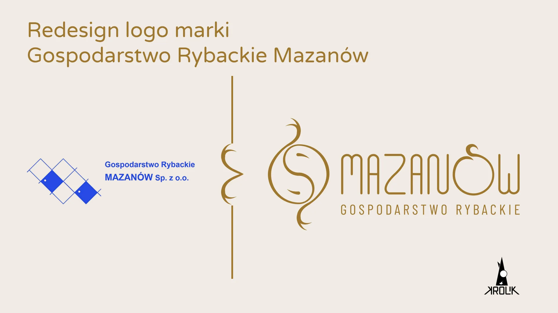
The old mark was dead –
the owners did not use it
The owner had made the logo himself earlier, in a basic editor, with no fonts and no colour scheme. The problem was not aesthetic: the owners had no attachment to the mark and in communication wrote out "Mazanów Fish Farm" instead of showing the logo. The mark existed because it existed, and set nothing in motion.
Fishing iconography was out –
ethically too
On the farm everything that causes fish suffering is banned: rods, hooks. The industry symbolism was out not only on the principle of non-literalness, but ethically too. Every early lead fell into a clichéd little fish or lost legibility – the sweet spot lay in "non-obvious, but legible".
They knew me as an artist –
they doubted the system
They had a real doubt whether an artist would build them a rigorous system. A mentor convinced them to test it, the results convinced them of the rest. That doubt turned out to be the best proving ground for my USP: an engineer fused with an artist.
The theme of the mark was not a fish,
but the harmony of duality
I started with a word map – fishing concepts out of Justyna's brief and looking for connections. The real theme turned out to be not the fish, but the joining of opposites: science and tradition, him and her, technology and nature. That directional decision ruled out literal iconography and set the search on a symbol of joining.
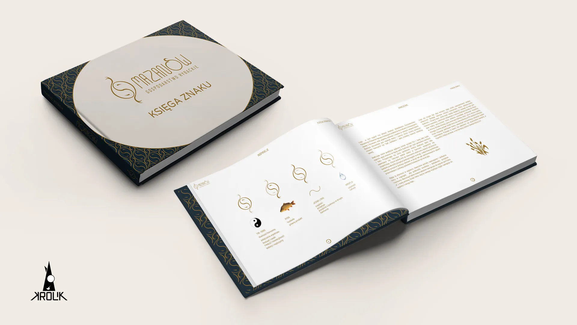
 Yin-yang
Duality and harmony. Joining of aspects: farming and science, tradition and innovation, woman and man.
 Fish
FishFarming, the main product.
 One line
Continuity, flow, one passing into the other, harmony.
 Drop
DropPurity, nature.
I shifted the name hierarchy:
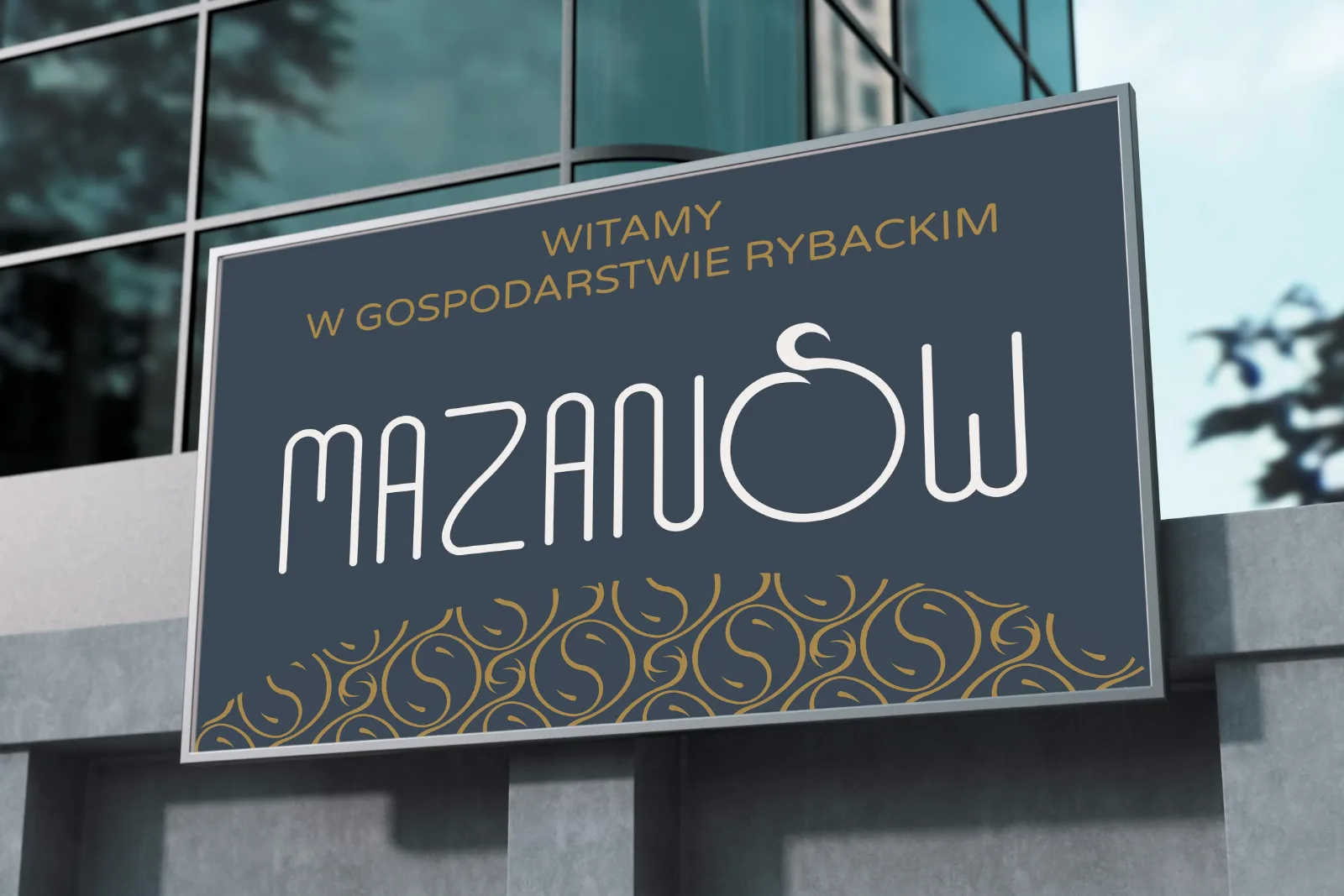
MAZANÓW before the category
"Fish farm" is a generic descriptor – nearly every farm has one, so it builds no brand. I shifted the emphasis to "MAZANÓW", with the descriptor as a subtitle. The mental model: Muszynianka and Nałęczowianka, which turned a place name into a brand. I went against the client's first instinct and won her over with an argument.
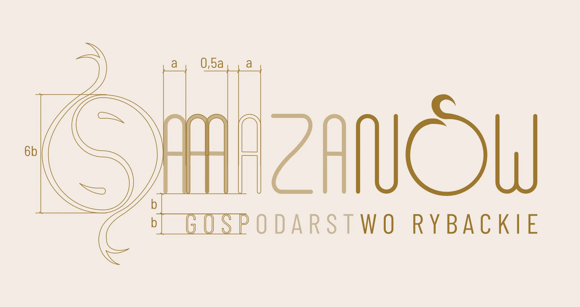
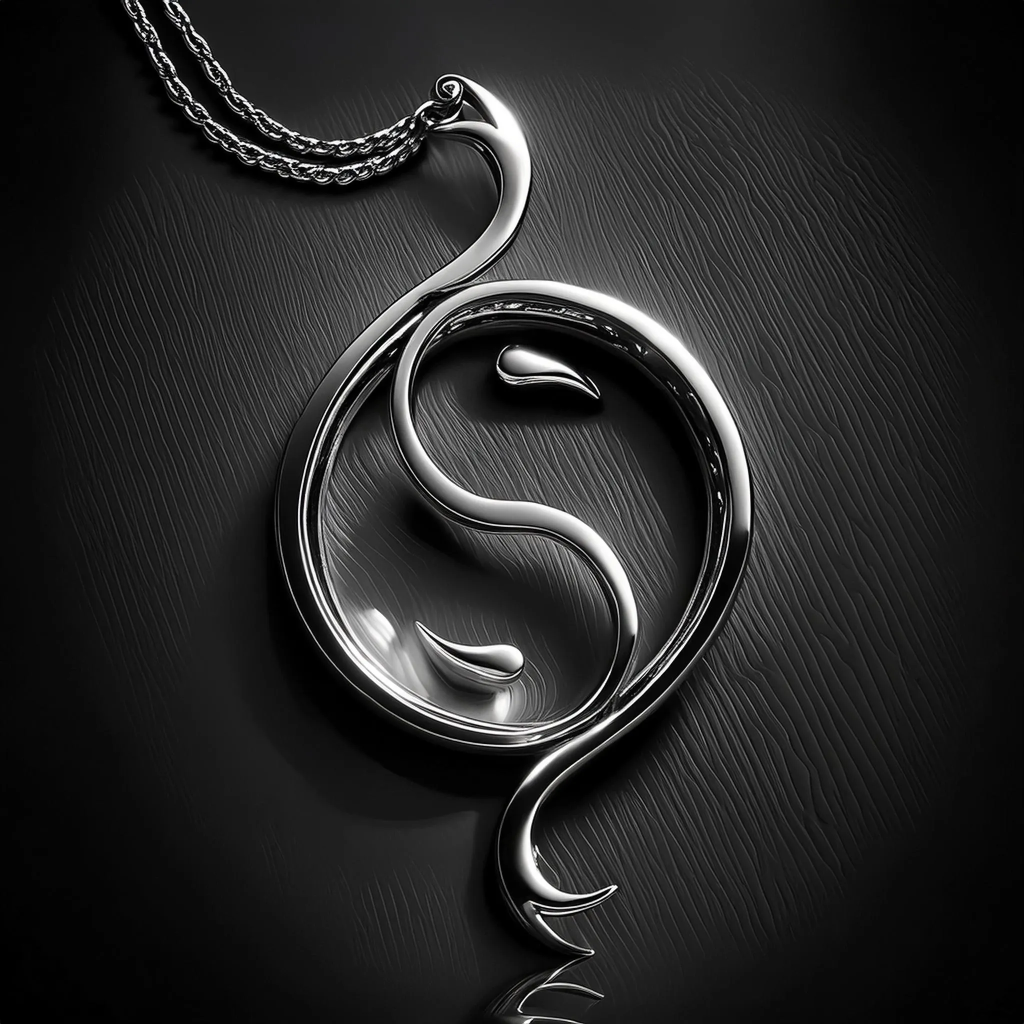
A yin-yang of two koi carp, drawn in one line
It struck me during a phone call: yin-yang as the character of joining duality, instantly linked to koi carp circling one another. Hence a mark drawn in one continuous line – which in meaning tied to passing the farm down from generation to generation.
The signet reads ambiguously: first the yin-yang, only then the fish.
I built the male–female harmony
into the letter construction
The balance was not sensed, it was designed. The word "MAZANÓW" got a font drawn from scratch, on a repeating "A" module: "M" is two "A"s, "N" is two "A"s, "Z" is two wide.
Repetition and a technical form give a masculine core beneath the soft, rounded surface of the letters. The brand theme here is not only told in the symbol, but built into the letters.
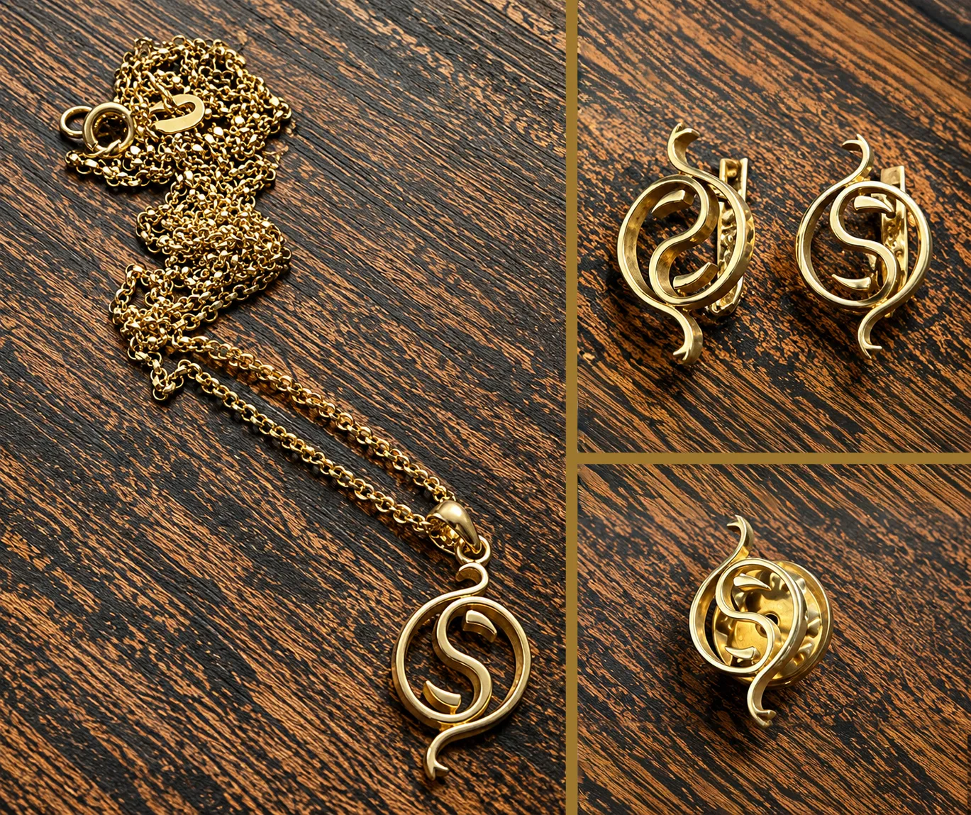
AI gave speed,
direction stayed on the human side
In Adobe Firefly I visualised the mark on jewellery – a necklace and cufflinks. The mark itself, the logotype, the system and every creative decision were made without AI. I treat it as a tool for speed, not the author of direction.
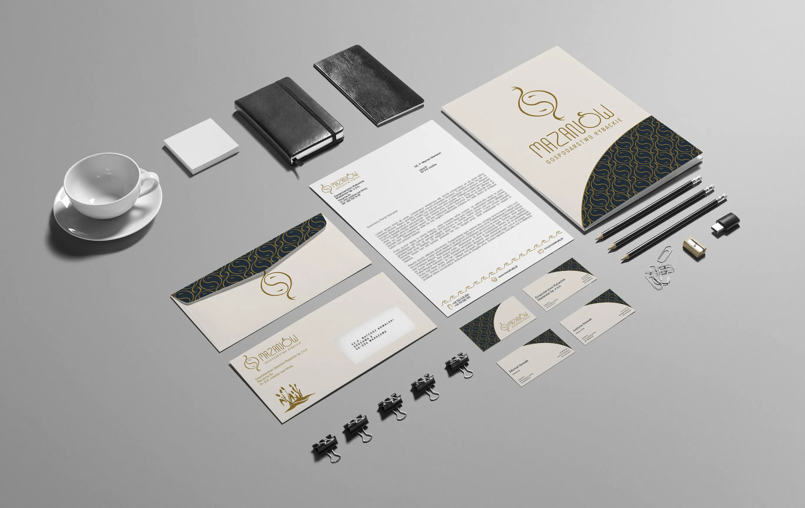
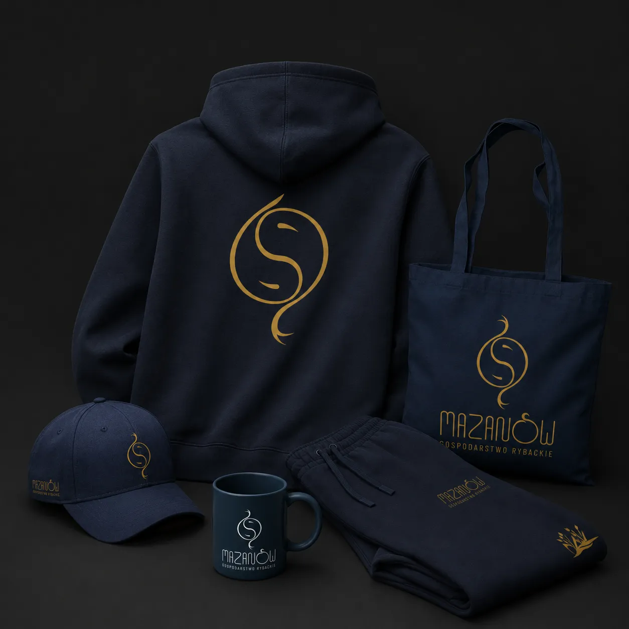
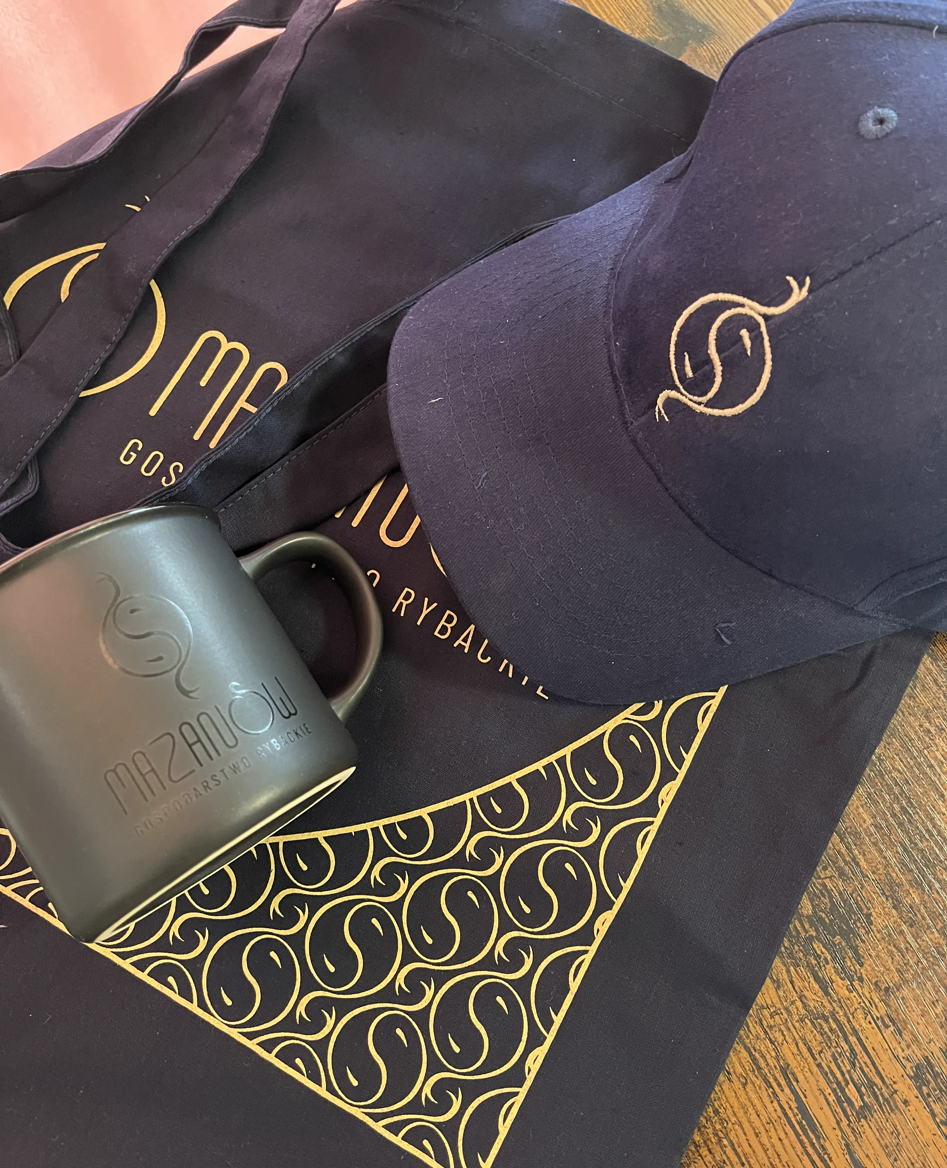
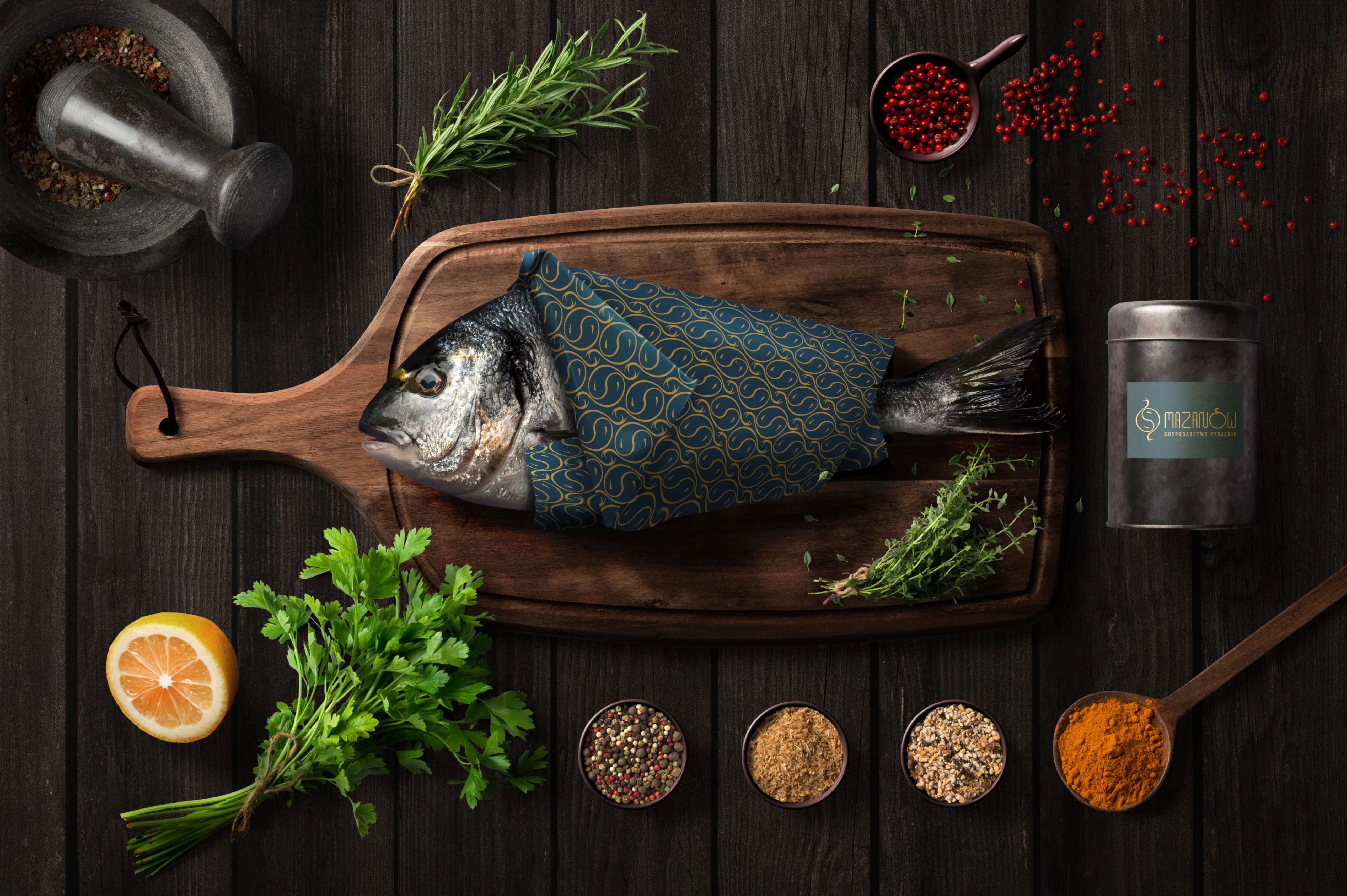
A coherent system: signet, bespoke
logotype, dual palette
Golden brown as the main colour – earthy, tied to nature. Plus Isabelline and Gunmetal, so communication can deliberately shift tone: lighter and lifestyle, or darker and scientific. A full brand book closes the whole.
From a logo they did not use,
to a mark they wear themselves
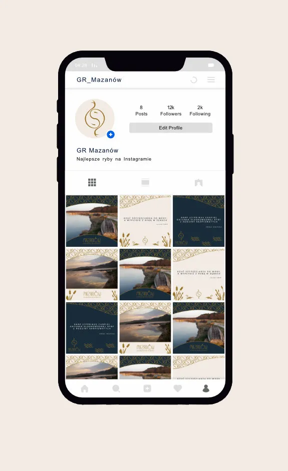
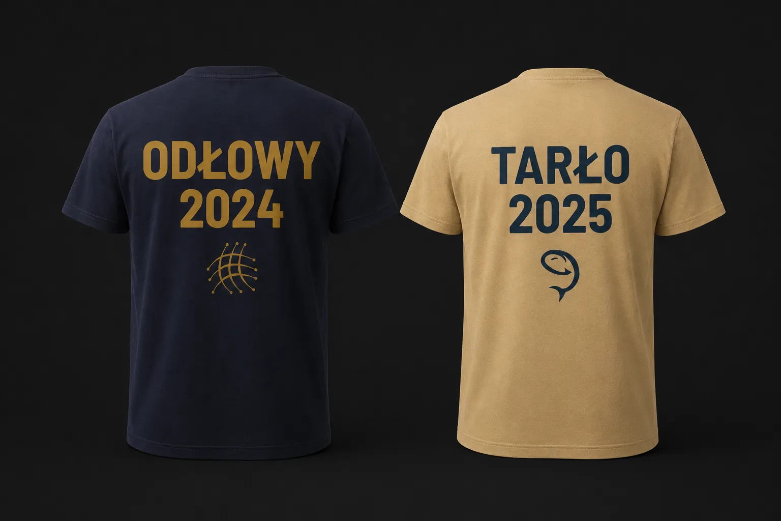
Today, on their own initiative, they roll it out on team apparel, company collateral and jewellery.
Justyna saw the jewellery visualisation and immediately said "oh, I want that", then ordered it from a jeweller. Staff in branded apparel became a team of one brand. Reading the meanings hidden in the mark, the owners recognised themselves in it – that is identity resonance, not mere aesthetic approval.
What Mazanów taught me
and what I'd add today
I delivered the main project solo in 2024. It showed how far a well-set mark reaches.
- A good mark not only solves a problem – it sparks an ambition that was not there before. The owners began considering promotion and merch they had not thought of with the old mark, and the new mark even opened B2C direction tests for a narrow group (the company stayed with B2B).
- Form can perform what it talks about – the modular letter construction carries the same message as the symbol.
- Accuracy comes from research before the first sketch. The word map recognised the essence before I drew anything.
- Next time I'd show the client the process more, as it happens – the process itself builds trust and engagement.
- If I did this project today, AI would speed up research and application mockups. The creative core would stay human.
Ongoing contact with Mazanów continues to this day; we keep adding new elements as we go. An identity that works inside and outside the company does not end with handing over the files.
HAVE A MARK
YOU DON'T WEAR?
Mazanów had one too. 30 minutes online – I break down your current image and give a concrete direction. No obligation to continue.
- 30 minutes – an online talk
- A breakdown of your current image
- A concrete direction and takeaways
- You set the rate, 99–999 PLN – I deduct it in full from the quote
- No obligation to continue