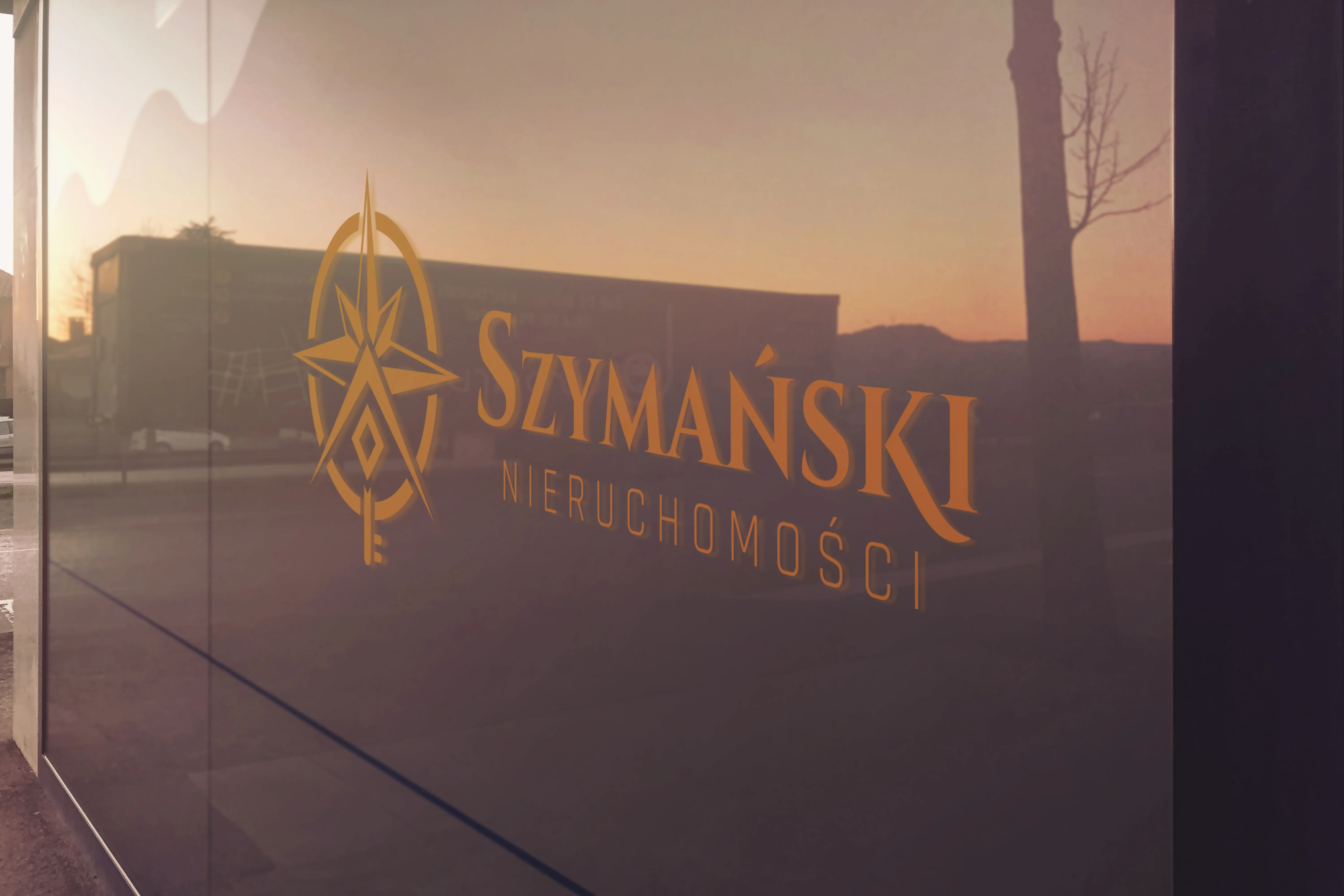
Szymański Real Estate
– a mark that leads home
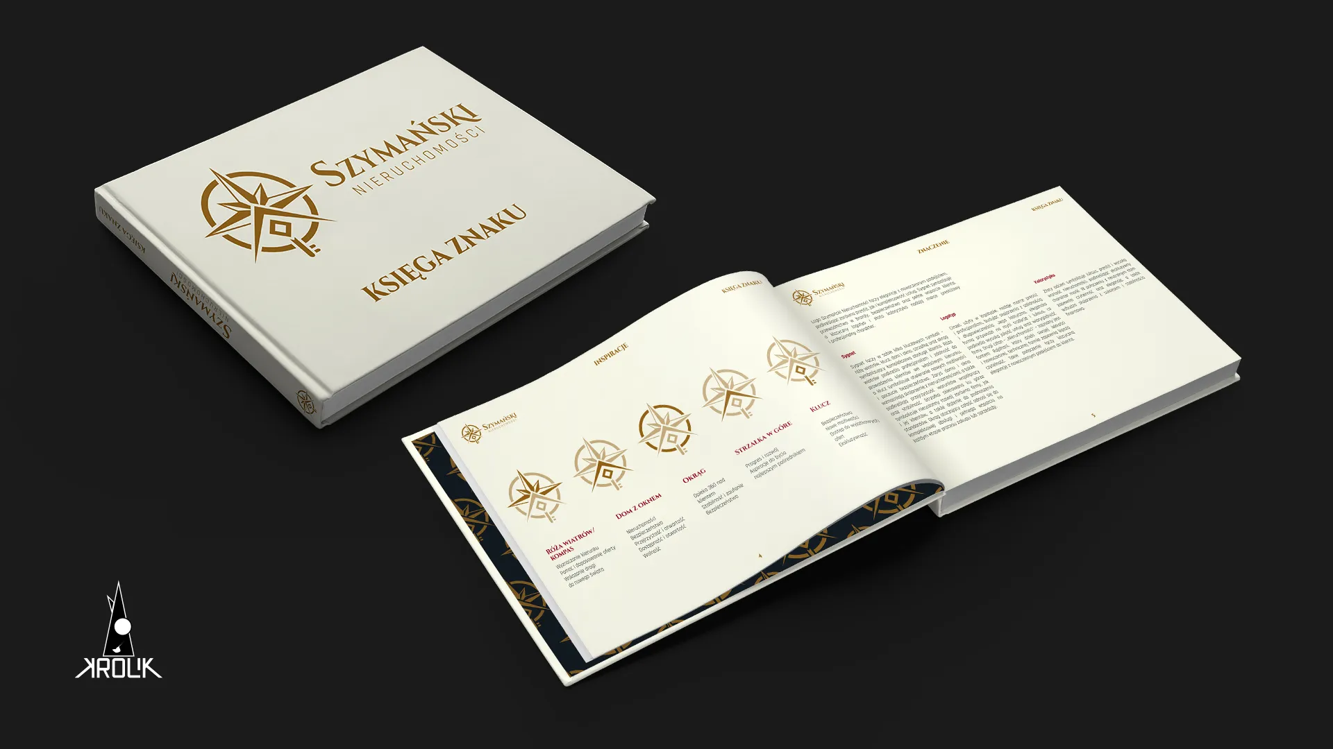
Marek entered real estate with a bang – a new company and a mark that builds trust at first glance. From a compass rose, through the logotype, to a full brand book and a wax seal.
Marek entered real estate
with a bang
Marek Szymański runs a real-estate agency in Silesia. He came with a simple goal: to enter a new business with a new company and a mark that builds trust at first glance. The agency was starting to deliver, so instead of settling for a template logo, he chose a full identity.
Marek is not a broker – he is a guide who offers a 360 service. He helps with renovations, arranges insurance, and is present at the notarial deeds.
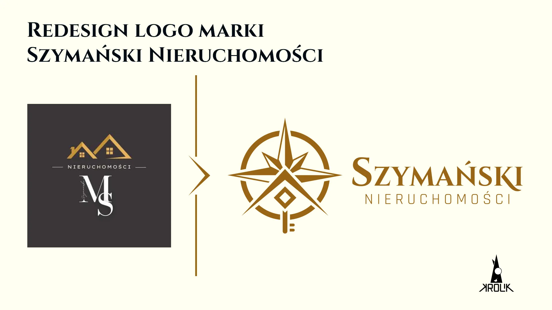
The old mark only said:
buy-sell
The starting point was a mark made of two little houses, a monogram of three competing fonts and a surname hidden so well you could not read it. The industry was legible, and that was all.
No hierarchy, no guiding of the eye, zero layer of meaning.
Two identities
at once
Marek came with a brief to build identities for two of his companies – the agency and a clothing brand. Two identities in parallel, plus a long scoping stage. Today I set stage close-out points at the start of a collaboration, not midway through it.
An undecided
brand name
The mark was created alongside the identity decision – it had to carry a name that was not yet settled.
The risk of
overload
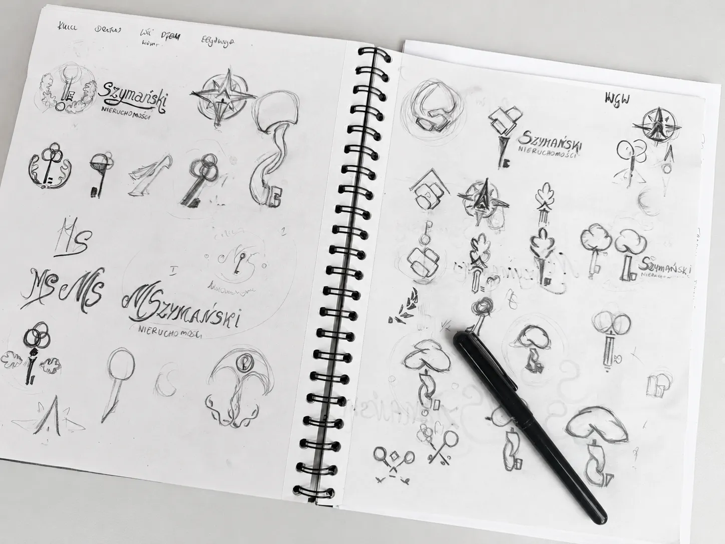
Compass rose, key, house, window, circle and arrow in one mark. The main design battle was reduction, not addition.
The compass rose: a symbol of the path
a client walks with an advisor
The talks revealed a mission wider than a transaction. I treated house-hunting as a voyage to a new world: the compass rose sets a direction and says the advisor guides you the whole way. It gave the mark a meaning the old one lacked – it shows guidance, not a transaction.
Each symbol clear on its own,
together they tell one story
I wanted a simple anchor in the industry, legible to anyone, and less obvious layers in line with my approach. Every element had to have a reason rooted in the company mission – whatever failed that rule, I rejected.
The main design battle was reduction, not addition. I simplified the signet until each element became part of the next: the north arrow is also the roof, the key is also the window. The window went from four squares to one so it works at small sizes.
Tree
of worlds
It had no mass next to the logotype.
Oak and nature
motifs
They drifted too far from a clear message about the industry.
Clasped
hands
Weaker in legibility than the compass rose.
I showed two paths,
not twenty variants
From the whole exploration I picked the two strongest proposals, each with a different naming decision. First: a handwritten MS Szymański signature with a hidden key, betting on the person behind the brand. Second: the compass rose carrying the full 360 service.
The compass rose won.
The average viewer sees a compass,
a key and a house
Underneath, each element carries a concrete promise of the company. Five symbols, each with a reason rooted in the mission.
 Compass rose
Sets the direction and guides the client through the whole process.
 A key that is a window
Opens new possibilities and brings clarity to the terms.
 Roof
RoofThe north arrow anchors the mark in real estate without a literal house.
 Upward arrow
Growth of the company and the client, reaching for a higher standard.
 Circle
Closes the whole: 360 care at every stage.
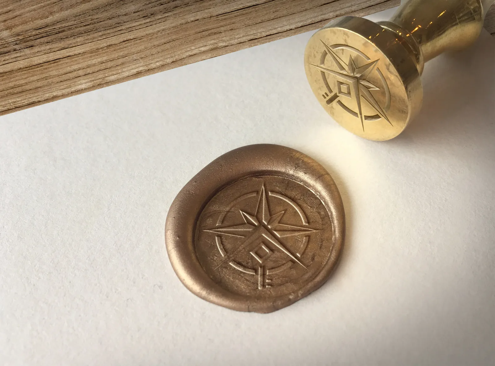
The wax seal forced
maximum simplicity in the mark
Marek dreamed of handing over notarial deeds sealed in wax. I verified it in design and prepared visualisations of the impression in wax.
A mark meant to work pressed into wax cannot have a single needless line. Form and production medium are one decision.
Marek did not file it away –
he started expanding the brand himself
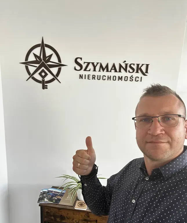
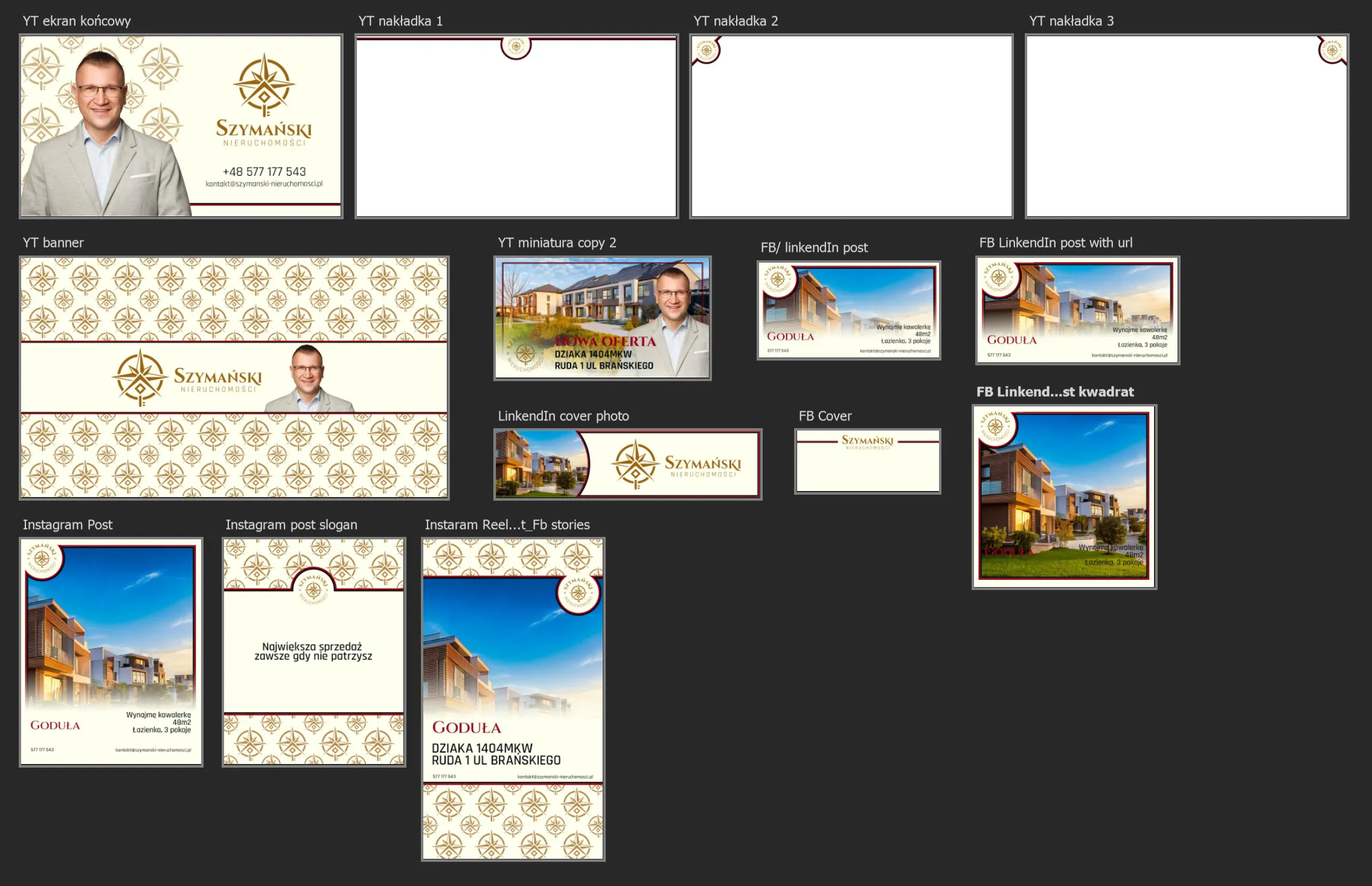
On the finished system Marek introduced stationery himself, opened a new office with the new logo and took on sponsoring athletes.
The mark appeared on footballers' shirts, and the company materials became coherent. A pattern repeats that I see in other projects too: a good mark opens a person up to bolder moves.
What this project taught me
and what comes next
A solo project from brief to a full brand book. It showed how far a mark reaches when set against a real medium and a real mission.
- I hit a rare register: a mark credible to someone who moves large sums, yet not off-putting to the average viewer. Elegance without ostentation.
- Reduction proved harder and more important than addition. Each element had to become part of the next.
- Verifying the mark against real media – the seal, small sizes – protects the project from surprises.
- I now set stage close-out points at the start of a collaboration, not midway through – it protects the project from endless iterations.
The direction ahead: close out the hard rollout data with the client and show the mark in real-world use. A good mark opens a person up to bolder moves.
HAVE A MARK
YOU DON'T WEAR?
Szymański had one too. 30 minutes online – I break down your current image and give a concrete direction. No obligation to continue.
- 30 minutes – an online talk
- A breakdown of your current image
- A concrete direction and takeaways
- You set the rate, 99–999 PLN – I deduct it in full from the quote
- No obligation to continue