MetaHealth: an identity
the competition could not fake
A medical trainer with a brand that already worked but, beyond the name, said nothing about him. I gave him a mark with five hidden meanings – a phoenix fused with a DNA helix – under which he moved the rivalry to where an imitator cannot reach.
The brand already worked,
but the mark said nothing about him
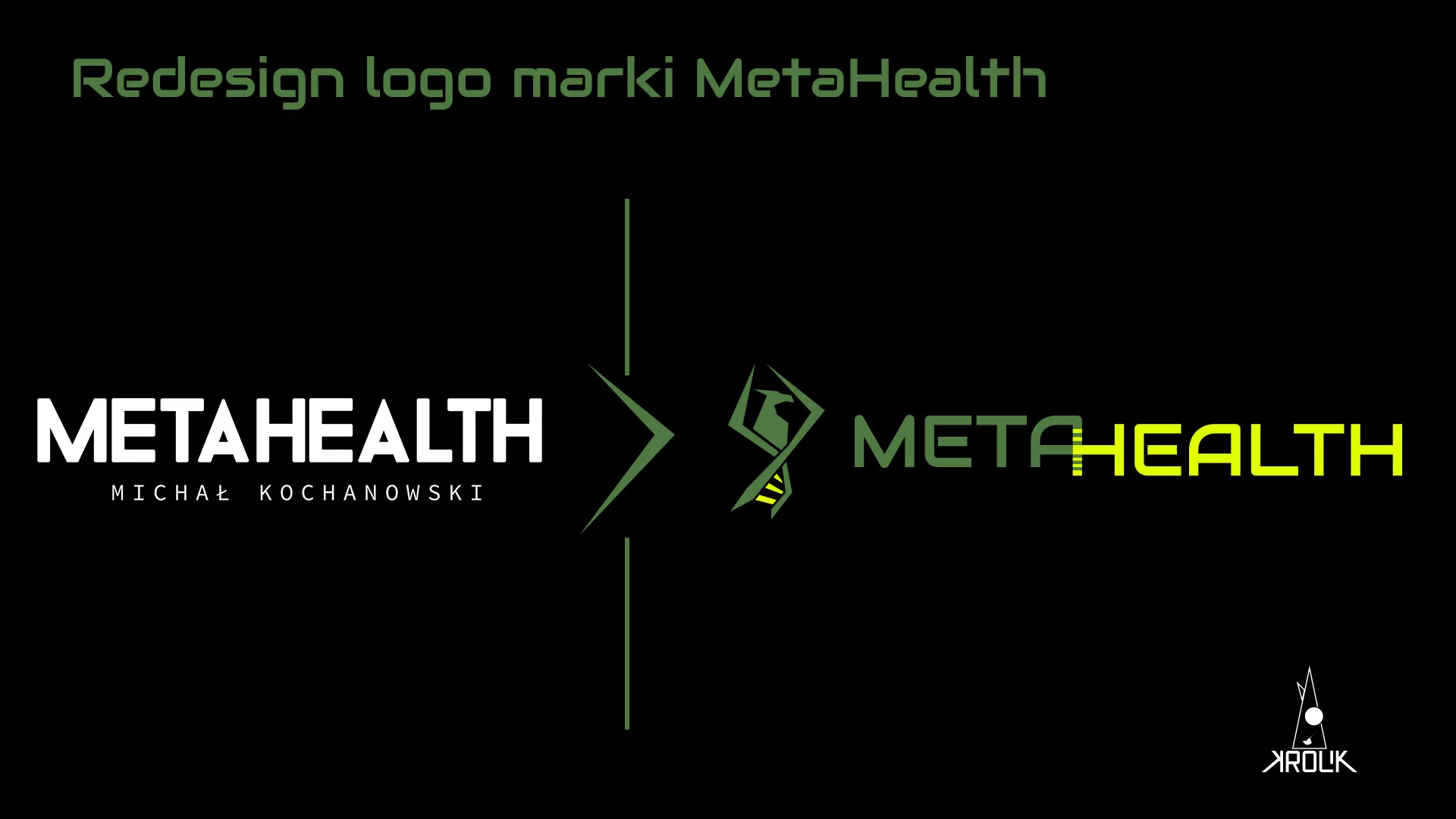
Michał Kochanowski is a medical trainer from near Poznań, specialising in returns after ACL injuries. He came to me with a brand that worked: a good reputation, recognition in gyms, a clean logotype made by his girlfriend.
The font was chosen well, but beyond the name the mark said nothing about Michał.
Imitators copied the methods –
he needed a mark that cannot be faked
Michał's rates were higher than others', so competitors started copying his techniques and repeating the behaviours alone, without the knowledge behind them. He needed a mark under which Michał would gather his clients and move the rivalry to where an imitator cannot reach – into who he really is.
Because the real difference only emerged in conversation. Michał presented himself as a tough, scientifically grounded trainer with no weaknesses – but his story held a strong spiritual thread he feared, because it felt like weakness to him. That duality was exactly what an imitator would not copy. My task was to show it so that the spirituality strengthened the trainer's position rather than undermining it.
AT FIRST GLANCE HE IS A PURELY MASCULINE, FIRMLY GROUNDED MAN, A TRAINER WITHOUT WEAKNESS.
– from the diagnostic conversation
Dumbbells and a bodybuilder were not only
overused, but at odds with the values
The industry symbols clashed with the essence of his work. The obvious industry shorthands were out for a substantive reason, not an aesthetic one – the sweet spot lay in "non-obvious, but intriguing".
The cult of mass
versus health
Dumbbells and a bulked-up bodybuilder suggest flexing for looks alone, regardless of health. For Michał, health is the foundation of results, not their cost – the effects are meant to be lasting and built naturally, not vain lifting of ever-heavier weights for an empty image.
Too literal
to encode anything
A running figure and similar shorthands were too legible. An obvious image left no room for the narrative the mark was meant to carry.
The gym's reality
I did not know myself
I outsourced the palette check to a stylist who knew that world first-hand. The decision to exclude was substantive, not aesthetic.
I designed from the hidden story, not from the obvious association
I adopted one guiding principle. A good mark need not be legible at first glance – it should intrigue and open a conversation. More importantly, it should reach the owner first and give him a sense of identity, and only then the end client.
That ruled out literalness in favour of a narrative Michał reveals in contact with a client.
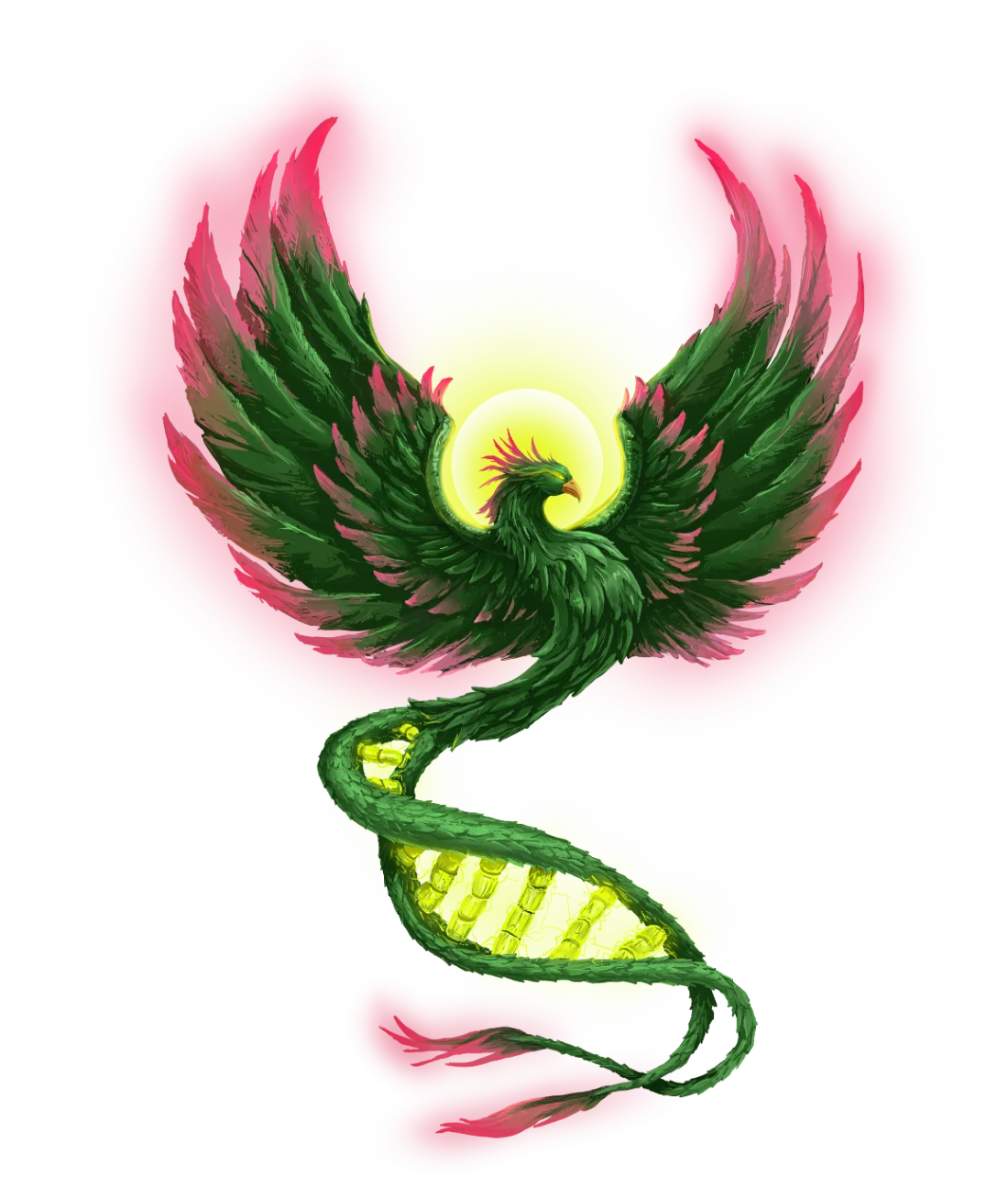
A phoenix joined with DNA
became the core of the signet
The phoenix carried two meanings at once: clients' renewal after injury and Michał's own spiritual path. DNA added a layer of science and medicine.
This decision, the riskiest in the whole project, I placed at the centre of the mark instead of hiding it.
Five meanings hidden
in one mark
The signet does not illustrate training. It is made of layers Michał reveals in conversation with a client, each with its own meaning.
 Phoenix
Rebirth, spirituality, longevity, hope, transformation.
 DNA
DNAScience, physicality, growth.
 Hourglass
Time – it is never too late to care for your health.
 Athlete
Naturally built strength and fitness – not the cult of mass.
 Arrow
ArrowGrowth, a clear goal, direction.

- Health as the foundationA subtle shift sets "HEALTH" lower – as the foundation the rest rests on. It visualises the principle "health above all": not a slogan overhead, but the ground beneath everything the trainer does.
- A + H crossThe letters A and H form a cross – the mark of a medical trainer, not a strength one.
A calm palette would not survive
in a gym – so we went neon
The first direction stuck to earthy red and tiger's eye – too heavy for the gym Michał wanted to enliven. After consulting the stylist I moved to a neon set: Fern Green, Chartreuse and Cool Gray. Only Cool Gray survived from the first version.
A magenta the client did not want
became the line for women
Michał did not like Hot Magenta. Instead of dropping it, I gave it a function: a variant aimed at female clients.
That gave the colour a reason to exist, and the client an argument he had not seen before.
The graphic alone did not convince,
only the story behind the mark did
Back then I worked by sending the finished project by email – the mark with a long description. Michał first saw the graphic alone and reacted uncertainly; everything changed only when he read in the message what the mark encodes.
Today I present marks live and control the order myself: the story first, then the reveal.
A competitor backed off, and clients
started asking for the shirts themselves
Over the following months the main competitor gave up the rivalry.
At the base was Michał's professionalism – the mark gave it a form that could not be faked. Michał took it on as his own identity and uses it wherever he can – and clients ask "what does it mean?", which gives him a pretext to bring them into the brand's values.
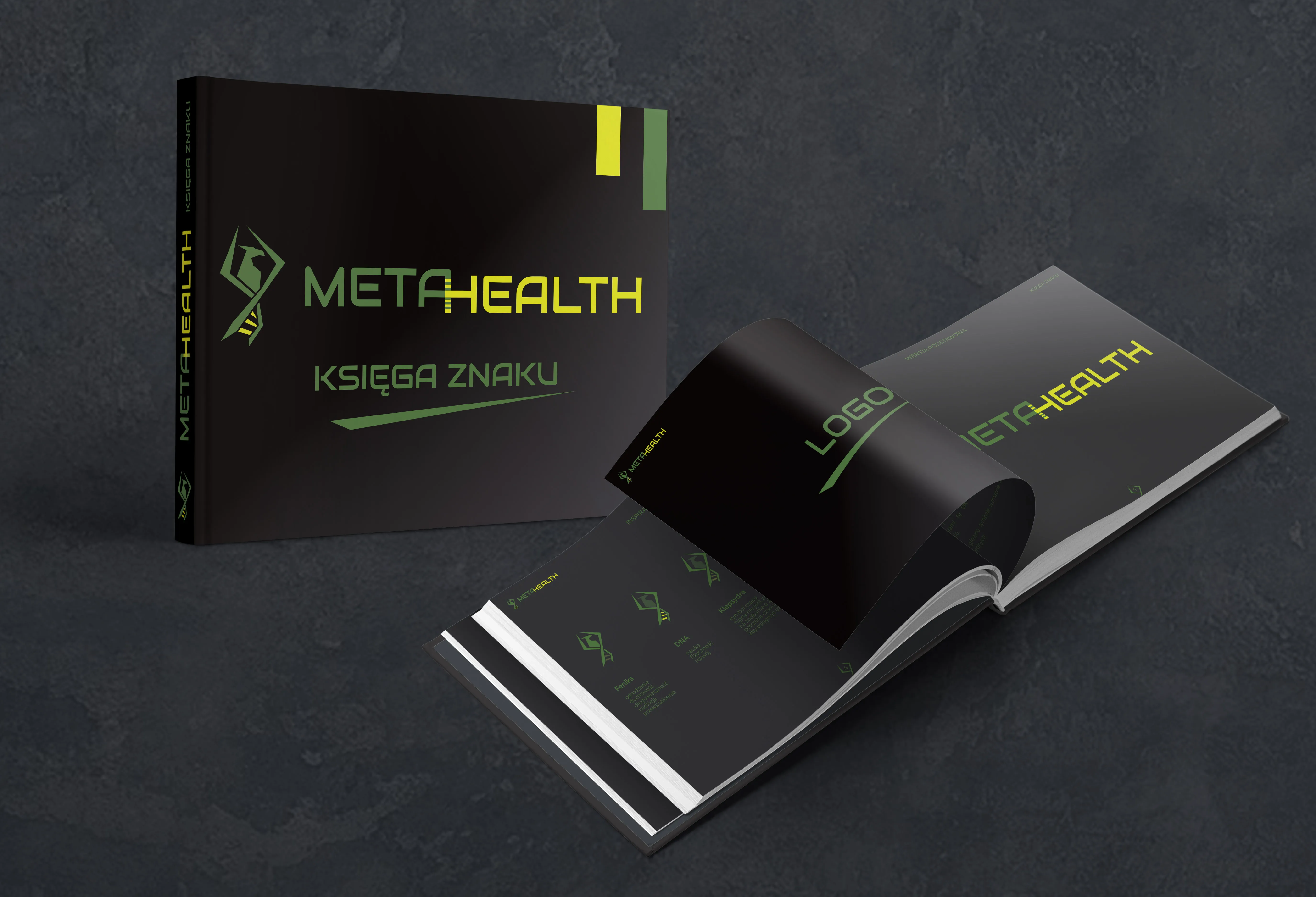
 The system on carriers – cap, bag, shirts, notebook.
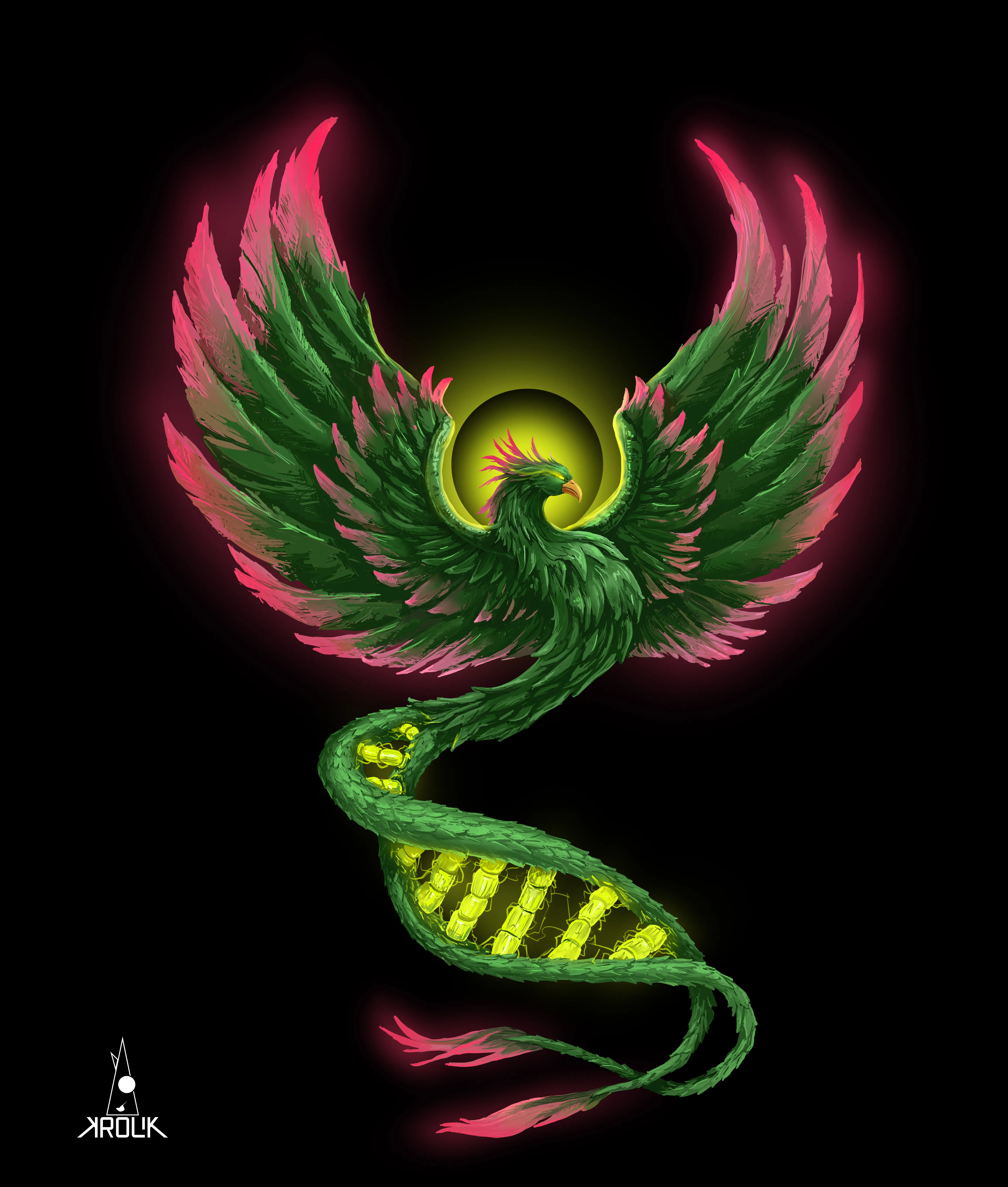 Painted phoenix – the mark went off-screen onto canvas.
 Bottle – "Health Above Everything".
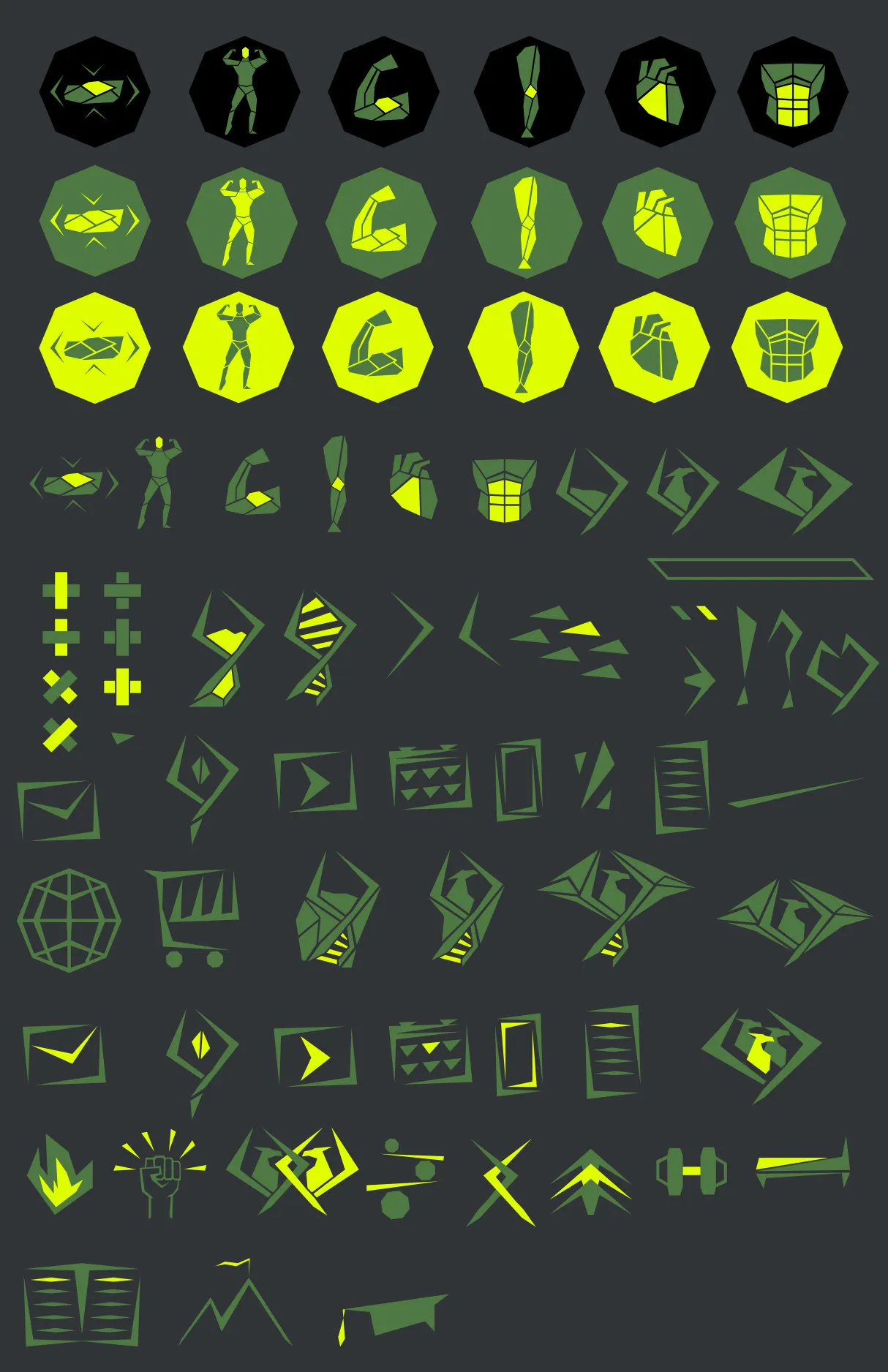 Element library – a system, not a single file.
A logo family
that grows on its own
What this project taught me
and what I'd do differently today
- Ambiguity is a function, not a flaw. A mark you have to read opens a conversation an obvious mark would not.
- The mark must first "win over" the owner. Only then does the owner carry it further.
- The story is part of the product, not an add-on. Form without it does not even work on the client.
- Escaping literalness can be a strategic decision – obvious symbols can clash with a brand's values.
- Today I present marks live, control the order of the narrative and keep to time norms I did not monitor back then.
- I keep AI where speed matters. The creative decision stays on the human side.
Michał came back to me for a painted phoenix, and the system began growing on its own onto new carriers. An identity that reached the owner first does not end with handing over the files.
HAVE A MARK
THAT ENCODES NOTHING?
MetaHealth had one too. 30 minutes online – I break down your current image and give a concrete direction. No obligation to continue.
- 30 minutes – an online talk
- A breakdown of your current image
- A concrete direction and takeaways
- You set the rate, 99–999 PLN – I deduct it in full from the quote
- No obligation to continue